The Boston Bruins, globally recognized as one of the National Hockey League’s esteemed “Original Six” franchises, actually joined the league seven years after its inception. Founded in 1924, they hold the distinction of being the first American team to enter the NHL, solidifying Boston’s place in professional hockey history. While not technically part of the league’s initial formation, their consistent presence and early establishment cemented their status within this elite group of teams.
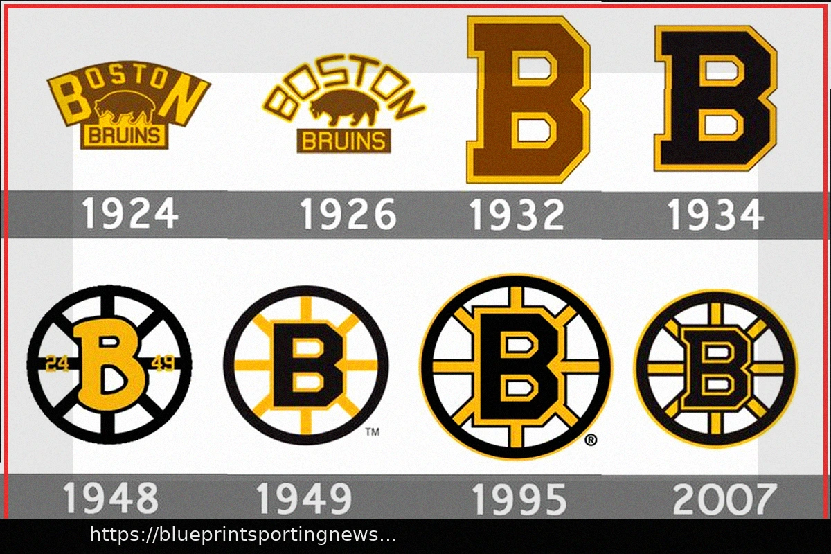
The journey of the Bruins’ iconic visual identity began with their very first emblem. The initial design prominently featured a brown bear, a direct nod to the team’s namesake, paired with a bold capital ‘B’. This early iteration set the foundation for a brand that would evolve while maintaining core elements of strength and regional pride.
Over the decades, the Bruins’ logo has undergone various refinements, culminating in the globally recognizable “Spoked B.” This distinctive design, which emerged in the late 1940s, symbolizes Boston as the “Hub of the Universe,” with roads and ideas radiating outwards from the city center. While the precise details and color schemes have adapted to different eras and uniforms, the fundamental concept of the “Spoked B” has remained a constant, embodying the team’s enduring legacy and connection to its home city.
From the early bear design to the modern, streamlined “Spoked B,” each evolution of the Boston Bruins logo tells a part of the team’s rich history, reflecting changes in design trends while preserving the spirit of one of hockey’s most storied franchises.